Problem
How might parents / legal guardians most effectively manage their school-aged children’s lunch and subsidy accounts in a mobile app?
Approach
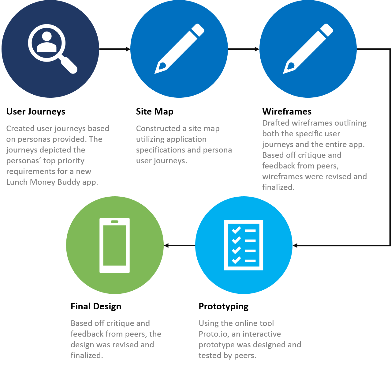
During this project, we created user journeys based on personas provided, created a site map and wireframes of the new app design, and used the online prototyping tool Proto.io to create and test a prototype of the newly designed app. The full process is displayed below.
Results
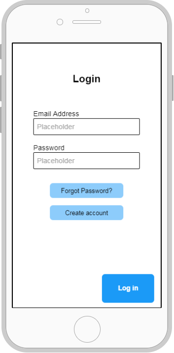
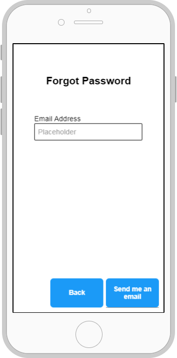
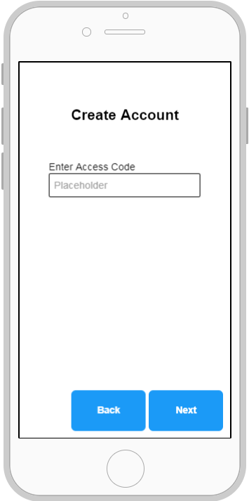
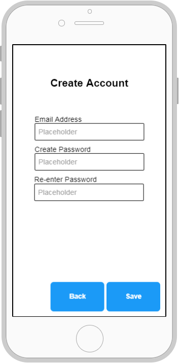
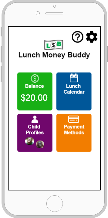
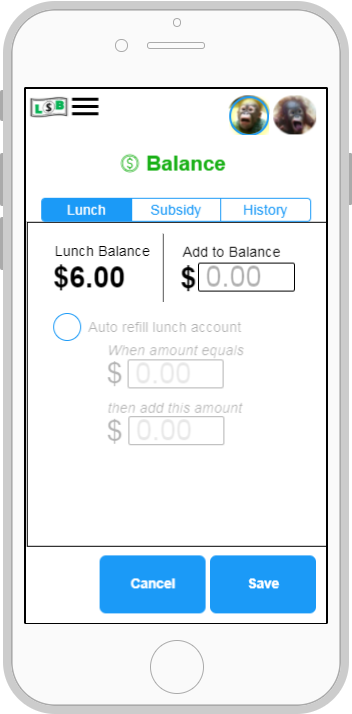
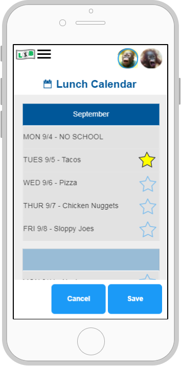
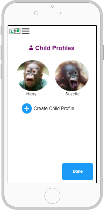
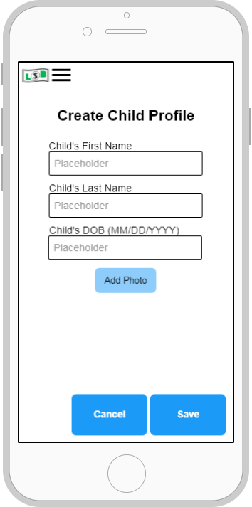
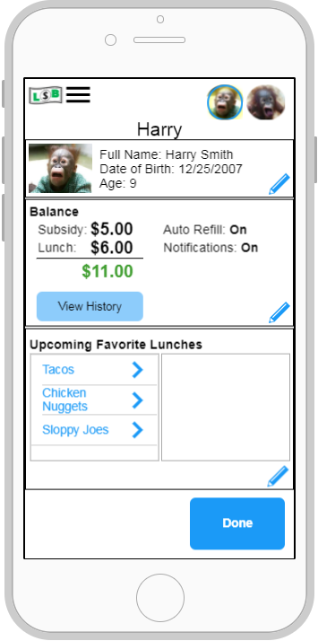
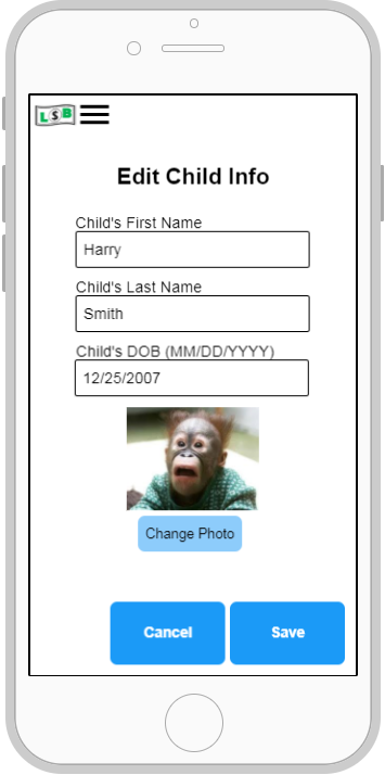
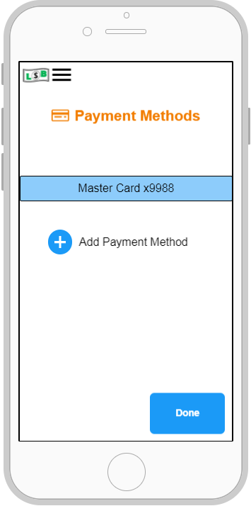
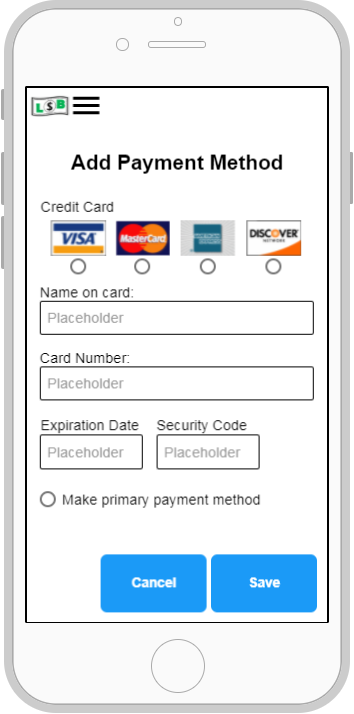
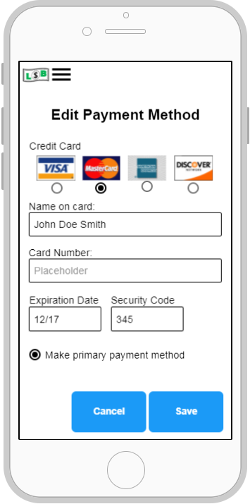
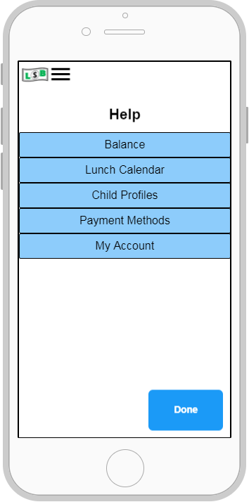
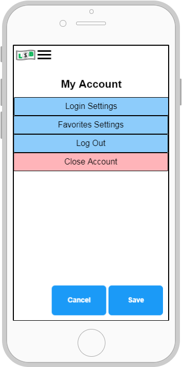
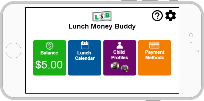
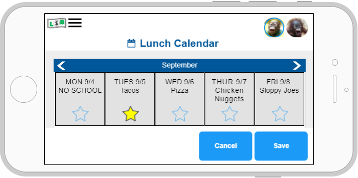
The problem was answered and a final design was constructed that met the needs of the users. The work done during this project resulted in the below final design for the new app.
Lessons Learned
To continuously improve and be even more skilled and knowledgeable for the next project, reflecting on what was learned is an important part of the process. Here are the lessons learned:
Personal
- Anticipate change. It’s okay if things change, as long as you’re driving to toward the end goal and keep the users at the forefront.
- Take negative and positive criticism as a way to improve your design. Although it can be difficult to hear at times, you’ll remember it for your next project; therefore, your projects will continue to get better and better.
Design
- It should be obvious which items initiate an interaction on the screen.
- The space on a screen should be effectively utilized whether it be in portrait or landscape orientation.
- Having a logo as a way to go back to the main screen can be helpful and seems to be a common practice.
- Have a warning message if a user wants to close their account, or in any case where a user could lose a lot of information.
- In this particular project, having one screen for the user to input just the access code is less frustrating since the user doesn’t end up inputting a bunch of information before being told the information is incorrect. This same technique could be applied in other projects.
- Having visual cues or color coordination could be beneficial for users in some, if not most cases.
- Although not used in the final prototype, having navigation tabs at the bottom of the screen can be effective because it allows users to navigate with only one thumb. This is something that I will take into consideration for future projects.
Click here to view full report
