Problem
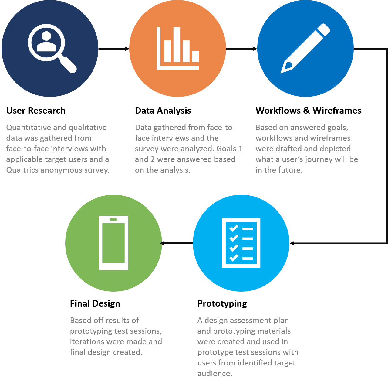
A company had launched a reminder app for mobile devices. They were unsure of what direction they should take with the product, but knew they wanted to expand it from just a generic app. They reached out in hopes of UX expertise to help determine what users they should focus on for the redesign, identify problems that need to be solved, and how to resolve them.
Approach
Results
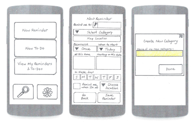
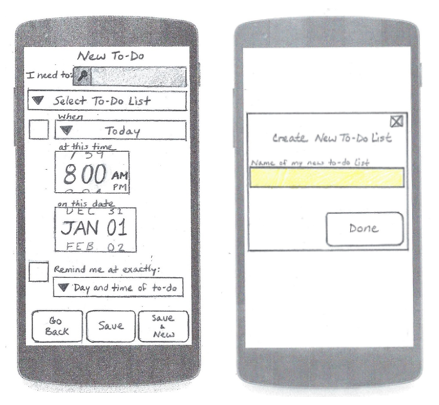
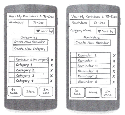
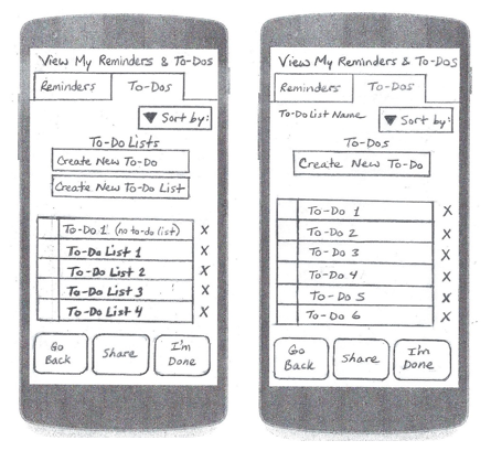
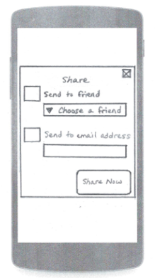
The problem was answered and the company was very pleased with the final design. All of the work during this project resulted in the below final design for the new app.
Lessons Learned
There were many lessons learned from this project. They include the following:
- Anticipate change in thinking and direction of the project. It’s okay if things change, as long as you’re driving toward the end goal.
- Anticipate change in design. It’s not going to be perfect, and there is most likely going to be something that you didn’t think about.
- Don’t assume you know your users. Users know themselves the best, so listen to them. They’re the ones that will buy the product after all.
- When asking users questions, whether it be in an interview or during a prototyping session, don’t be afraid to ask additional questions that may not be on your script. Your goal is to dig for answers. A good rule of thumb is to ask “Why?” often. You’d be surprised at how much useful and interesting information you can pull from it.
- Ask open ended questions during your user sessions. You’re not going to get a lot of data if you ask a yes or no question.
Click here to view full report
