
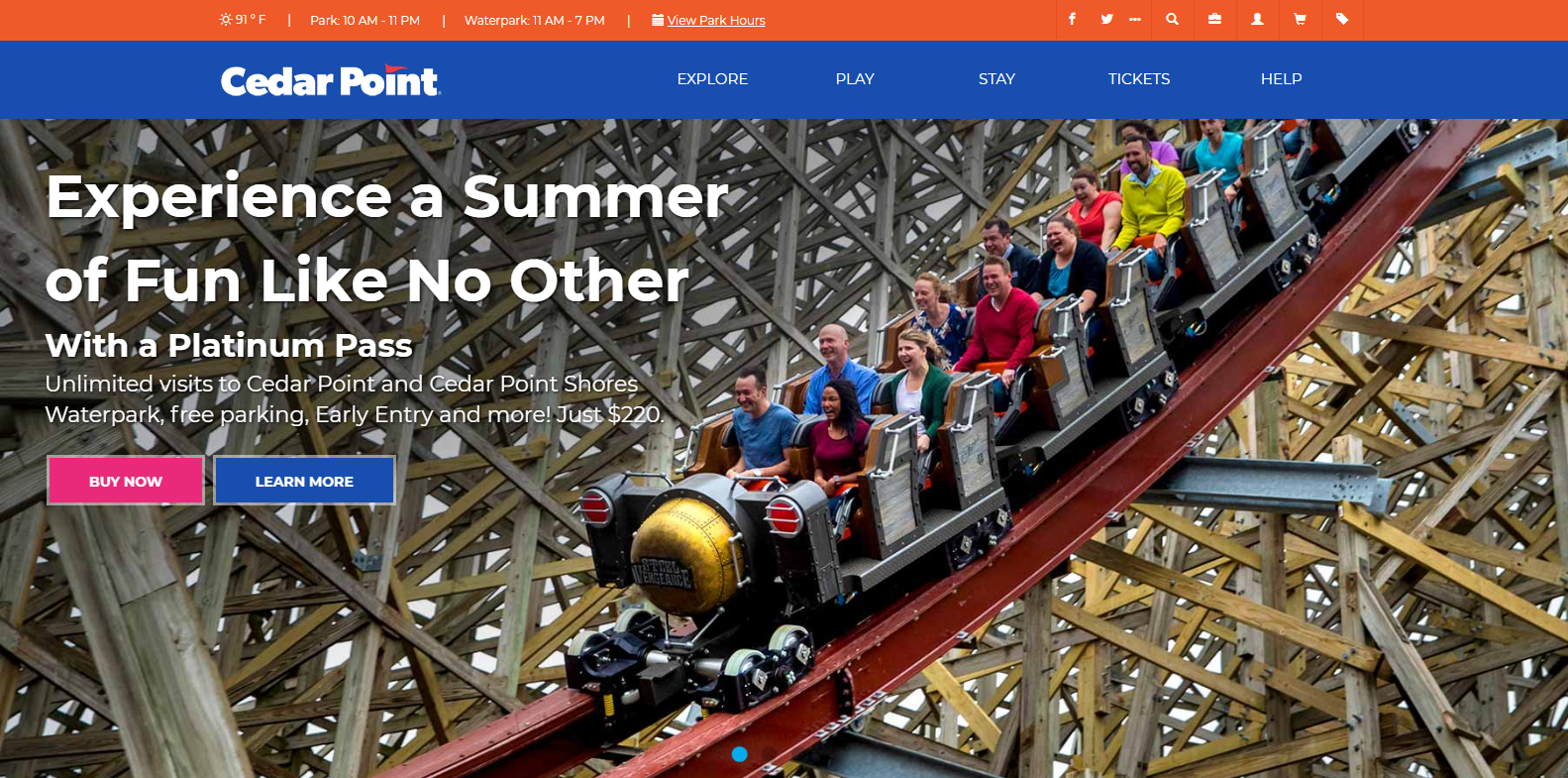
Problem
The satisfaction of Cedar Point’s website was unknown because its users weren’t fully understood. Performing user research for the site would allow us to understand their users’ needs and wants on the site and ensure that it is reaching its full potential.
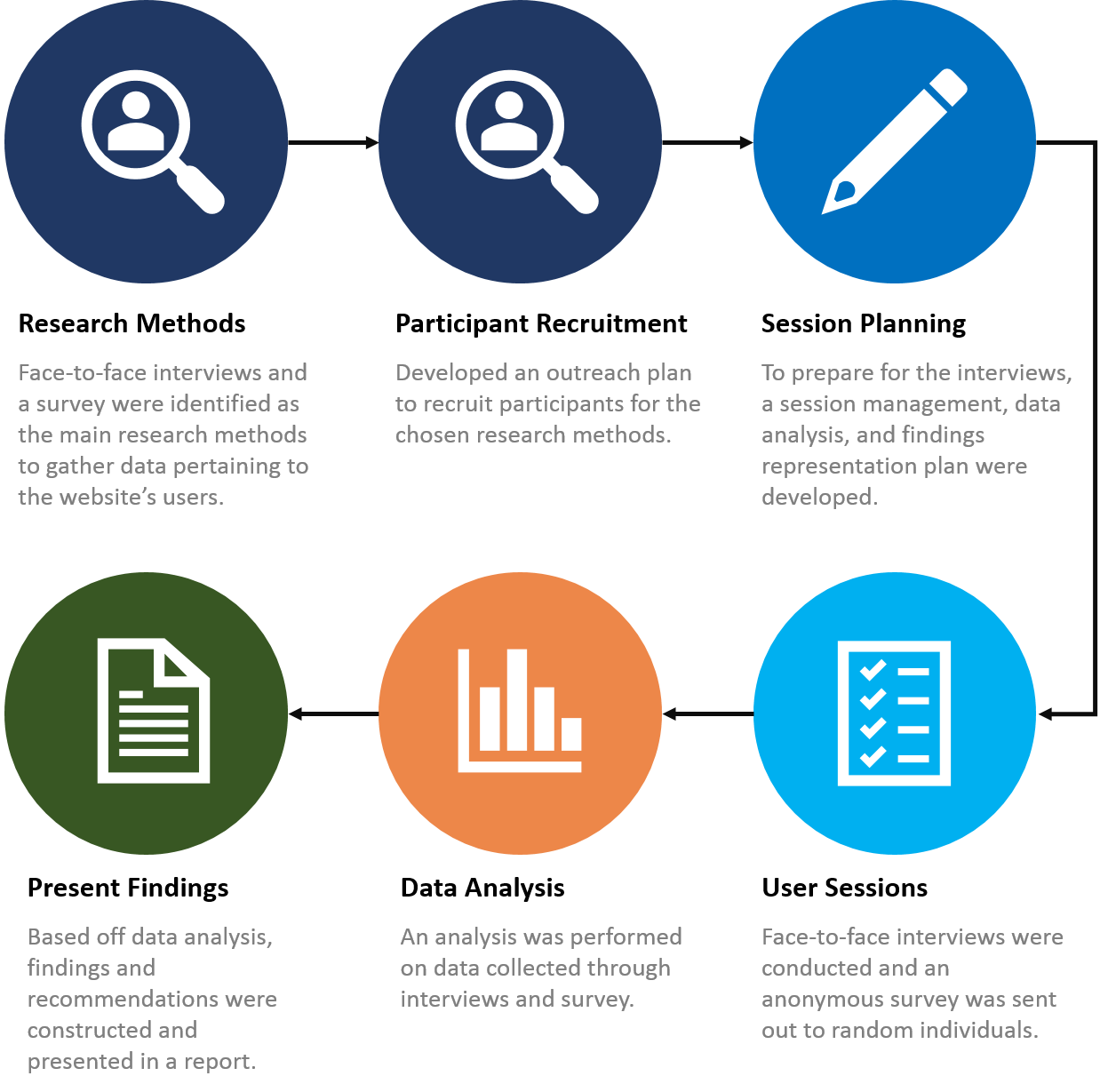
Approach
Results
A synopsis of the findings and recommendations are outlined below:
Findings
- Users need tickets and other general park information front and center as it’s the top reason users visit the website.
- Some of the navigation tabs are not clearly defined.
- Attractions are the top reason individuals visit the park, but not the website.
- Users want more pictures on the website that pertain to the rides.
Recommendations
- Since tickets and park information are the top priority for the website, it should be the first tab in the top navigation.
- More pictures of rides should be added to the home page.
- Add a section on the home page for new or upcoming attractions.
- Since attractions are what drive users to the park, we can use this opportunity to draw more traffic to the website by building on what they want.
- More user research needs to be done specifically on the navigation tabs and its contents to ensure it’s organized most effectively and the appropriate labels are being used to minimize ambiguity.
Lessons Learned
There were many lessons learned, including new skills from this project. They include the following:
- A lot of information can be found about users by simply sitting down and talking with them
- No assumptions should be made about what a user wants or needs; user research should always be an initial step
- Having multiple user research methods can provide both quantitative and qualitative data that helps build your case behind your recommendations to a client.
Click here to view full report