Problem
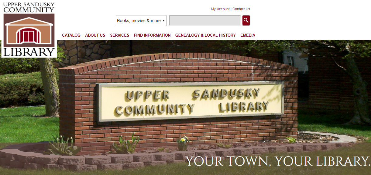
Upper Sandusky Community Library had noticed that users are having difficulties finding what they need on their website. They had reached out in hopes that we can provide expertise in this space to provide recommendations on how to rework their site so users can easily find what they’re looking for.
Approach
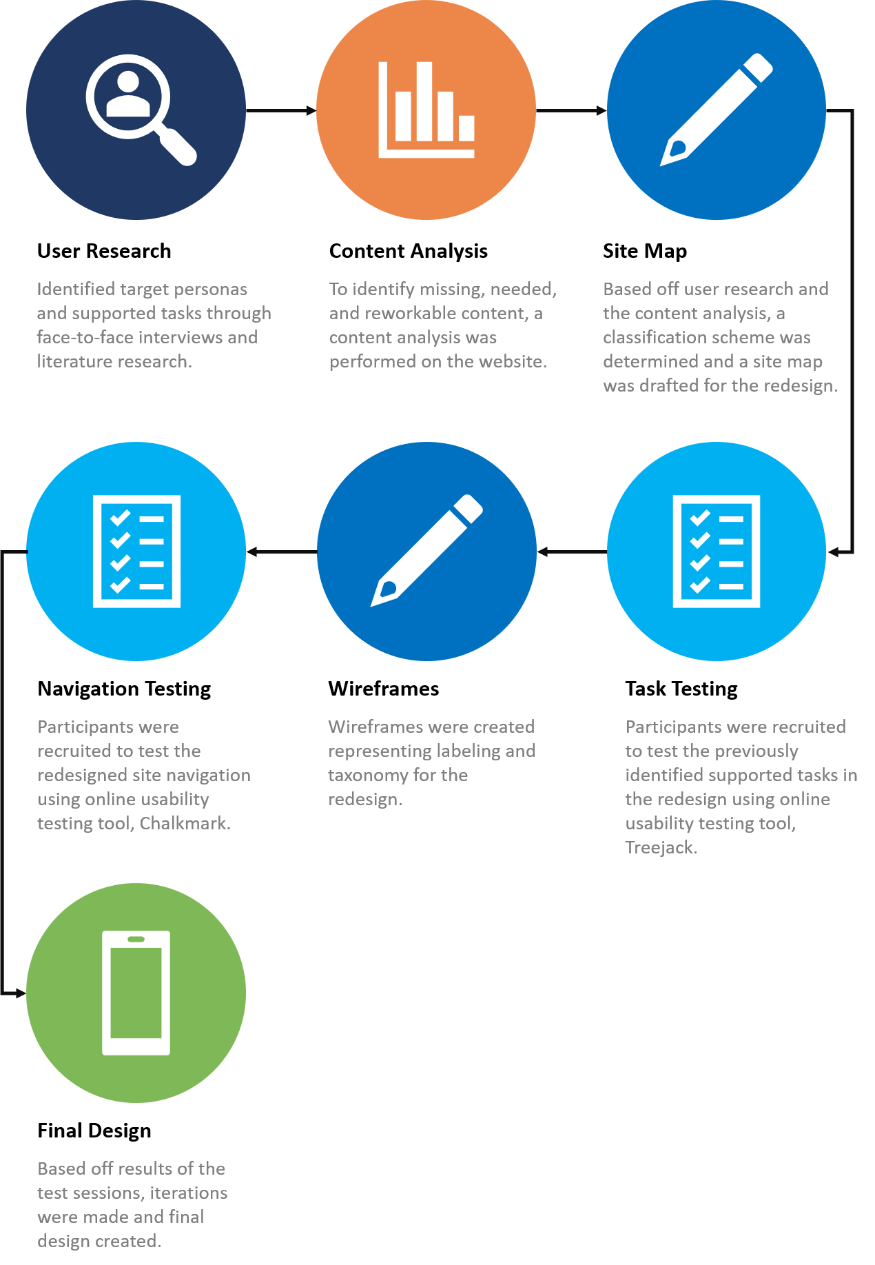
During the duration of this project, we conducted user research to identify target personas and supported tasks, performed a content analysis of the current site to determine what content is missing or needs to be reworked or removed, created a site map and wireframes of the new redesign, and tested the redesign using Treejack and Chalkmark usability testing tools. The full process is displayed below.
Results
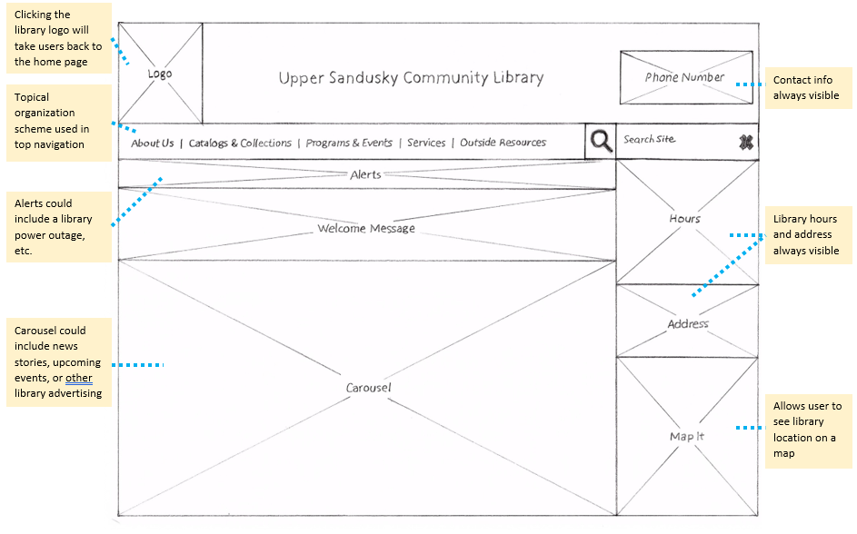
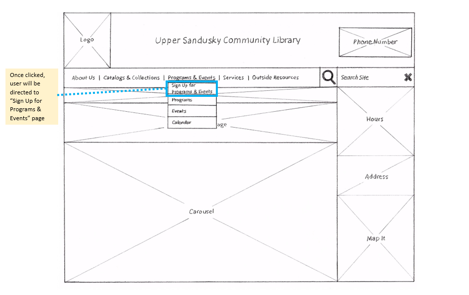
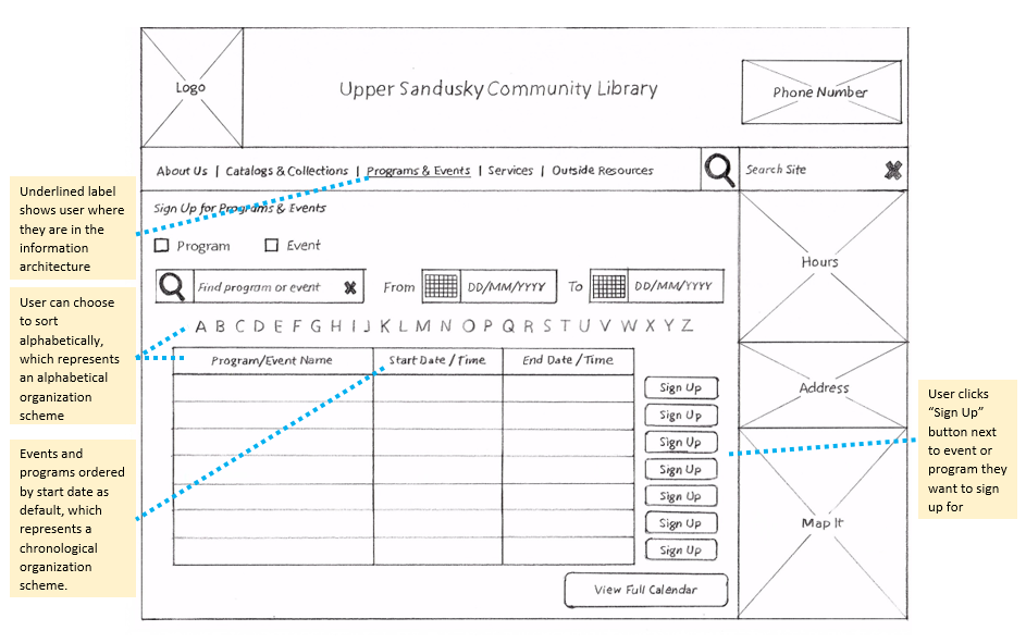
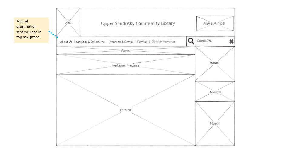
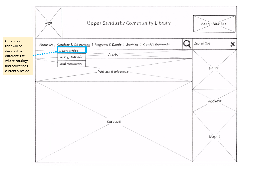
The steps taken during this project outputted the below final redesign for the Upper Sandusky Community Library website:
Lessons Learned
There were several lessons learned, including new skills from this project. They include the following:
- There are many usability tools available that can provide analytics and make user testing more efficient and user friendly, including Treejack and Chalkmark.
- Although tedious, content analysis is a good representation of the current state of content on a website.
- There are ways to organize and classify content, including ambiguous and unambiguous structures.
Click here to view full report
